Behind the scenes of the visual identity by Stahl R
'For the graphic design of this year’s IABR, we are looking for a visual language that conveys support, connection, and layering without coming across as overly technical or distant. The identity should be accessible to a broad audience while maintaining credibility within the international design community. The tone is inquisitive, inviting, and forward-looking. Concepts such as support, interdependence, infrastructure, and shared space may guide the design.'
This is roughly what a good briefing sounds like (in a nutshell). We often approach the design of a visual identity as if designing a visual language. We find or invent elements that can form visual “words” or “sentences,” and then design a system open enough for play and exploration, but coherent enough to be recognized as originating from the same sender. It’s a way of setting up rules for a game you’re about to play, rules that create the game itself. And the clearer the rules, the more fun it is to play.
Of course, a visual identity needs to have many layers, but sometimes you start with little things that catch your attention. In our very first meeting with the curators, Wouter Veldhuis, Headcurator SYSTEMS OF SUPPORT told us about one of his findings: that the acronym for the title SYSTEMS OF SUPPORT is SOS. This casual remark sparked our curiosity about the history of the emergency signal. It is the internationally recognized Morse code signal (...---...) for a maritime distress call, introduced in 1906 to request immediate assistance. Contrary to popular belief, SOS is not an abbreviation for “Save our Souls” or “Save our Ship,” but was chosen because of its distinctive Morse code rhythm. It soon became clear that SOS would play a major role in communication during moments of emergency.
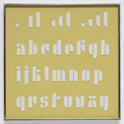
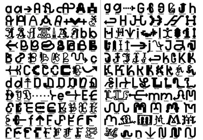
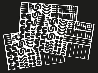
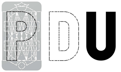
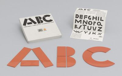
In Morse code, dots and dashes form a complete alphabet. Something similar serves as the starting point for this year’s visual identity. Two years ago, we received an internship application from Fanny Liebhardt, a recent graduate of the Burg Giebichenstein University of Art and Design in Halle, Germany. At that time, we couldn’t really offer internships because our teaching and international work meant we weren’t in the studio enough to provide a solid structure for interns. However, we were deeply impressed by her Bachelor’s thesis, 'Type Treasury,' which she developed together with Tessa Darimont. They developed a set of forms and, through collaborative play, created glyphs and eventually an alphabet. This is not entirely new: Joseph Albers developed a stencil lettering system, Bruno Munari designed 'ABC con fantasia', and Dries Wiewauters used a stencil to explore the liberties and restrictions of a unified grid. But Tessa Darimont and Fanny Liebhardt managed to push boundaries and use a limited set of elements to design an entire typographic ecosystem with many alphabets of very different appearances (casual, wonky, solid, indecisive, adventurous, etc.), all within a single system. Each uppercase letter has countless variations, leading to even more variations—though not yet designed. This resonated very well with our vision for how this year’s Biennale design would look: small, singular parts forming an open, complex, yet (human) system. So, this is our starting point for this year’s visual identity; we are now setting up the rules and looking forward to finally playing the game.
Stahl R is a Berlin-based design studio founded in 2013 by Tobias Röttger and Susanne Stahl and supported by Kathrin Baumgartner since 2022.
They work across a diverse range of design disciplines: from visual identities, publication design, environmental design, editorial and art direction, to time-based media and digital projects.