Visual Identity - Approach and Perspectives by Studio Le Roy Cleeremans
The IABR 2024 aims to redefine architecture by promoting a sustainable relationship with nature. This is also reflected in our design approaches, where signs, uses, and concepts not only complement the curatorial theme, but showcase the potential within design practices. Our goal is to make the IABR’s themes clear and accessible to all, transforming its visual identity into a tool that questions and proposes new methods of creation, collaboration, and inspiration. We see each project as an opportunity to innovate and commit to more prospective, respectful, and inclusive practices.
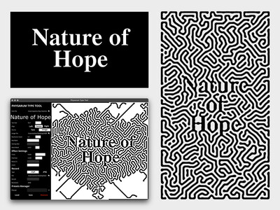
Nature of Hope – Cellular Automata
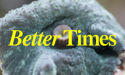
The Nature of Hope identity reveals an animated title based on our retail typeface ‘Better Times’ (Le Roy Cleeremans w/ Adèle Gallé), interpreted by a cellular automaton, a specific code system that simulates natural processes (Physarum Type Tool by Maxence Duterne). Based on a simple set of rules, the more the automaton evolves, the more complex it becomes, as a symbol of the non-binary and organic systems of life.
IABR 2024 Logo
The Nature of Hope’s graphic identity is also meant to act as a takeover of the existing, in the same way that nature asserts itself in a human-made context. We thus saw the opportunity to take over the IABR logo during the biennale, just as the ‘A’ concept by Richard Niessen invites us to do. We then chose to work with the semi-pixelated font ‘Visual’ (Jan Novák, AllCaps Foundry), which blends geometric and organic forms to reflect both the organic grid theme of our automaton and the interplay between Rotterdam’s urban grid and its green spaces. In addition, we’re using the ‘Union’ typeface (Radim Pesko, RP Digital Type Foundry) for its clarity, ensuring accessibility to all viewers.
Gradients
To complement the theme, Le Roy Cleeremans collaborated with (graphic) designer Maxence Duterne, who tailor made a small digital tool that generates color gradients from online found footage of landscapes. This tool allows the designers to capture and blur the representation of natural environments, and introduced a color palette that illustrates seasonal temporality from spring to winter, a passing of cyclical time in line with the duration of the Biennale.

Routing
The signage system is inspired by the shapes iterated by our cellular automaton – organic and fluid, contrasting with an urban grid. We will use sustainable materials and favor direct printing methods to minimize environmental impact and waste. Our signs will not only guide visitors, but also serve as platforms for a variety of content, enhancing the spatial and poetic qualities of the exhibition space.