New visual identity IABR designed by Richard Niessen together with Our Polite Society
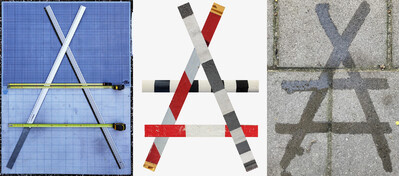
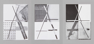
We are proud to unveil the IABR’s new logo and corporate identity, designed by Richard Niessen and Our Polite Society. At the heart of the design is a frame in which the ‘A’ of ‘architecture’ functions both as an identifier for the IABR and as an abstract symbol for new values, referencing an archetypal form of shelter, the tent, or the easel upon which the other can work. Whatever the interpretation, the logo is a unifying element that allows different voices to be part of a larger whole.
The ‘identity’ of a person is never fixed, but constantly evolves. This is why Richard Niessen was surprised to find that the visual identities of most organizations consist of a set of fixed components and follow rigid rules. He wondered what a more ‘porous’ visual identity might look like, one that could change over time, adapt, and absorb multiple voices.
After being selected to redesign the visual identity of the IABR, a labyrinthine search ended with the generous idea of a ‘support structure’, an ‘arrangement’, a ‘construction’ that would allow for many different interpretations and expressions. Richard then invited Our Polite Society (OPS) to work with him on the design and development of the IABR website and primary communications.
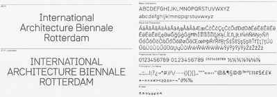
While searching for a typeface that would fit this identity, OPS proposed the development of a custom typeface that would follow the concept of the open sketch. Inspired by the use of template rulers for architectural drawings and ‘norm types’, the bureau designed a mono-linear typeface that is a hybrid of technically constructed and human-made letterforms.
Its basic identity is the seed for future interpretations and additions by many other designers.